프로젝트 환경 : react + vanilla extract
필터에 사용할 컴포넌트 중 slider 를 구현하기 위해 아래 패키지를 적용하였다.
https://github.com/n3r4zzurr0/react-range-slider-input
GitHub - n3r4zzurr0/react-range-slider-input: React component wrapper for range-slider-input
React component wrapper for range-slider-input. Contribute to n3r4zzurr0/react-range-slider-input development by creating an account on GitHub.
github.com
input 두 개를 이용해서 구현하는 방법도 있지만, 구현 난이도가 높고 시간이 오래 소요될듯 하여 라이브러리를 적용하게 되었다.
이번 기회에 MUI 를 써볼까 했는데 emotion 을 기반으로 하기 때문에 불필요한 의존성이 추가되어야 하는 점과,
다른 컴포넌트는 직접 구현하는데 slider 한 개의 컴포넌트때문에 MUI 를 설치하는건 좀 무거워질 수 있다고 생각했다.
구글에 'react slider input' 라고 검색했을때 가장 위에 나오기도 했고, 구현할 수 있는 데모 디자인이 몇가지 제시되어있는데
내가 구현하고자 하는 모습과 유사한 스펙을 갖고있는 것 같아 채택하였다.
추가로, 주간 다운로드 횟수는 25k 수준(이게 높은건진 잘 모르겠음. 검색결과 나온 다른 라이브러리에 비해서는 약 2배 높음)이고,
마지막 배포가 2개월 전으로 유지보수가 잘 되고 있는 것 같았다.
props와 스타일링을 위한 문서가 잘 나와있다.
또, 타입 정의도 잘 되어있다.
import type { FC } from 'react';

export type Orientation = "horizontal" | "vertical";
export type Step = number | "any";

export type InputEvent = [number, number];
export type InputEventHandler = (event: InputEvent) => void;

export interface ReactRangeSliderInputProps {
  /* @default null
   * Identifier string (id attribute value) to be passed to the range slider element.
   * */
  id?: string;

  /* @default null
   * String of classes to be passed to the range slider element.
   * */
  className?: string;

  /* @default 0
   * Number that specifies the lowest value in the range of permitted values.
   * Its value must be less than that of max.
   * */
  min?: number;

  /* @default 100
   * Number that specifies the greatest value in the range of permitted values.
   * Its value must be greater than that of min.
   * */
  max?: number;

  /* @default 1
   * Number that specifies the amount by which the slider value(s) will change upon user interaction.
   * Other than numbers, the value of step can be a string value of any.
   * */
  step?: Step;

  /* @default [25, 75]
   * Array of two numbers that specify the default values of the lower and upper offsets of the range slider element respectively.
   * If set, the range slider will be rendered as an uncontrolled element. To render it as a controlled element, set the value property.
   * */
  defaultValue?: [number, number];

  /* @default []
   * Array of two numbers that specify the values of the lower and upper offsets of the range slider element respectively.
   * If set, the range slider will be rendered as a controlled element.
   * */
  value?: [number, number];

  /*
   * Function to be called when there is a change in the value(s) of range sliders upon user interaction.
   * */
  onInput?: InputEventHandler;

  /*
   * Function to be called when the pointerdown event is triggered for any of the thumbs.
   * */
  onThumbDragStart?: () => void;

  /*
   * Function to be called when the pointerup event is triggered for any of the thumbs.
   * */
  onThumbDragEnd?: () => void;

  /*
   * Function to be called when the pointerdown event is triggered for the range.
   * */
  onRangeDragStart?: () => void;

  /*
   * Function to be called when the pointerup event is triggered for the range.
   * */
  onRangeDragEnd?: () => void;

  /* @default false
   * Boolean that specifies if the range slider element is disabled or not.
   * */
  disabled?: boolean;

  /* @default false
   * Boolean that specifies if the range is slidable or not.
   * */
  rangeSlideDisabled?: boolean;

  /* @default [false, false]
   * Array of two Booleans which specify if the lower and upper thumbs are disabled or not, respectively.
   * If only one Boolean value is passed instead of an array, the value will apply to both thumbs.
   * */
  thumbsDisabled?: [boolean, boolean];

  /* @default 'horizontal'
   * String that specifies the axis along which the user interaction is to be registered.
   * By default, the range slider element registers the user interaction along the X-axis.
   * It takes two different values: horizontal and vertical.
   * */
  orientation?: Orientation;

  /*
   * Array of two strings that set the aria-label attribute on the lower and upper thumbs respectively.
   * */
  ariaLabel?: [string, string];

  /*
  /* Array of two strings that set the aria-labelledby attribute on the lower and upper thumbs respectively.
   * */
  ariaLabelledBy?: [string, string];
}

const ReactRangeSliderInput: FC<ReactRangeSliderInputProps>;

export default ReactRangeSliderInput;
import type { ReactRangeSliderInputProps } from "react-range-slider-input";
import RangeSlider from "react-range-slider-input";
import "react-range-slider-input/dist/style.css";
import { description, rangeSlider, rangeWrapper } from "./style.css";
type SliderType = ReactRangeSliderInputProps & {
unit?: string;
width?: number;
};
const Slider = ({
value,
disabled,
onInput,
unit = "unit",
width = 200,
...props
}: SliderType) => {
return (
<div className={rangeWrapper} style={{ width: width }}>
<RangeSlider
disabled={disabled}
rangeSlideDisabled={disabled}
className={rangeSlider}
value={value}
onInput={onInput}
{...props}
/>
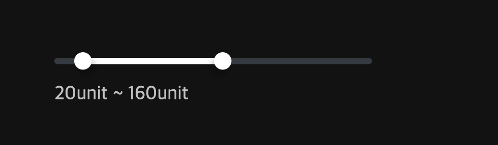
<p className={description}>
{value?.[0]}
{unit} ~ {value?.[1]}
{unit}
</p>
</div>
);
};
export default Slider;
컴포넌트 자체는 이런 식으로 작성을 했고, 상위에서 onChange로 value 상태 관리를 하도록 했다.
문서를 참조해서 아래와 같이 스타일링 할 수 있었다.
import { globalStyle, style } from "@vanilla-extract/css";
import { Color, ColorVar } from "../../styles";

// track (배경)
export const rangeSlider = style({
  width: "100%",
  height: "4px",
  borderRadius: "1000px",
  backgroundColor: Color.secondary.default,

  selectors: {
    "&::before": {
      content: '""',
      position: "absolute",
      top: "-8px",
      bottom: "-8px",
      left: 0,
      right: 0,
      zIndex: 0,
      pointerEvents: "auto",
    },
  },
});

// 선택된 구간
globalStyle(`${rangeSlider} .range-slider__range`, {
  height: "100%",
  backgroundColor: Color.primary.default,
});

//thumb 일괄 스타일
globalStyle(`${rangeSlider} .range-slider__thumb`, {
  width: "11px",
  height: "11px",
  borderRadius: "50%",
  backgroundColor: Color.primary.default,
  transition: "width 0.1s ease, height 0.1s ease",
});

//thumb 개별 스타일
globalStyle(`${rangeSlider} .range-slider__thumb[data-lower]`, {
  boxShadow: "2px 4px 4px 0 rgba(0,0,0,0.25)",
});

globalStyle(`${rangeSlider} .range-slider__thumb[data-upper]`, {
  boxShadow: "-2px 4px 4px 0 rgba(0,0,0,0.25)",
});

//thumbs hover
globalStyle(
  `${rangeSlider} .range-slider__thumb[data-active]:not([data-disabled]), ${rangeSlider} .range-slider__thumb:hover:not([data-disabled])`,
  {
    width: "13px",
    height: "13px",
  },
);

//DISABLED 스타일
//배경
globalStyle(`${rangeSlider}[data-disabled]`, {
  opacity: 1,
});
// 구간 disabled
globalStyle(`${rangeSlider}[data-disabled] .range-slider__range`, {
  backgroundColor: ColorVar.greyBlue[5],
});

//thumbs disabled
globalStyle(`${rangeSlider}[data-disabled] .range-slider__thumb`, {
  backgroundColor: ColorVar.greyBlue[5],
});

// Slider 외 스타일
export const rangeWrapper = style({
  display: "flex",
  flexDirection: "column",
  gap: "12px",
  padding: "8px 0",
  position: "relative",
});

export const description = style({
  fontSize: "12px",
  lineHeight: "14px",
  fontWeight: "400",
  color: Color.text.light,
});
특히 이 부분은, track 막대 높이는 유지하면서 위 아래 클릭가능한 여유 공간을 추가하기 위해 작성했다.
어떻게 구현할 지 막막해서 gpt 도움을 받았다.
기존 스타일은 유지하면서 가상 클래스를 이용하는 방법을 알게 되었다. 다음에 또 써먹어야지
  selectors: {
    "&::before": {
      content: '""',
      position: "absolute",
      top: "-8px",
      bottom: "-8px",
      left: 0,
      right: 0,
      zIndex: 0,
      pointerEvents: "auto",
    },
  },
라이브러리를 쓰는거에 대한 어떤 두려움이 있었는데
필요에 맞는 적절한 라이브러리를 찾고, 문서를 보면서 적용하는 경험이 즐거웠다 : )

'개발개발 > Date-project' 카테고리의 다른 글
| 배럴 파일 자동 생성 스크립트 (0) | 2025.04.09 |
|---|---|
| 모노레포 vite build 결과물이 이상해요? (0) | 2025.04.08 |
| svg 컴포넌트로 사용하기 (0) | 2025.03.31 |
| [스토리북] ColorPalette 컬러 팔레트 만들기 (0) | 2025.03.13 |
| [vanilla-extract] Sprinkles 로 스타일 토큰 만들기 (0) | 2025.03.13 |


